Buffet
UX/UI DESIGN, BRANDING, CREATIVE STRATEGYROLE: Creative Director
Buffet is a social platform startup based in LA. They encourage platonic and romantic relationships, providing a potential connection and a place or activity that both of you might like.

About
I came aboard at Buffet as their Creative Director.
When I joined, the co-founders needed someone to improve their app’s overall UX and UI design and to create a brand that would set them apart in a crowded market.
We launched Buffet on March 15th, 2024 in the App Store.

DISCOVERY
Design Audit
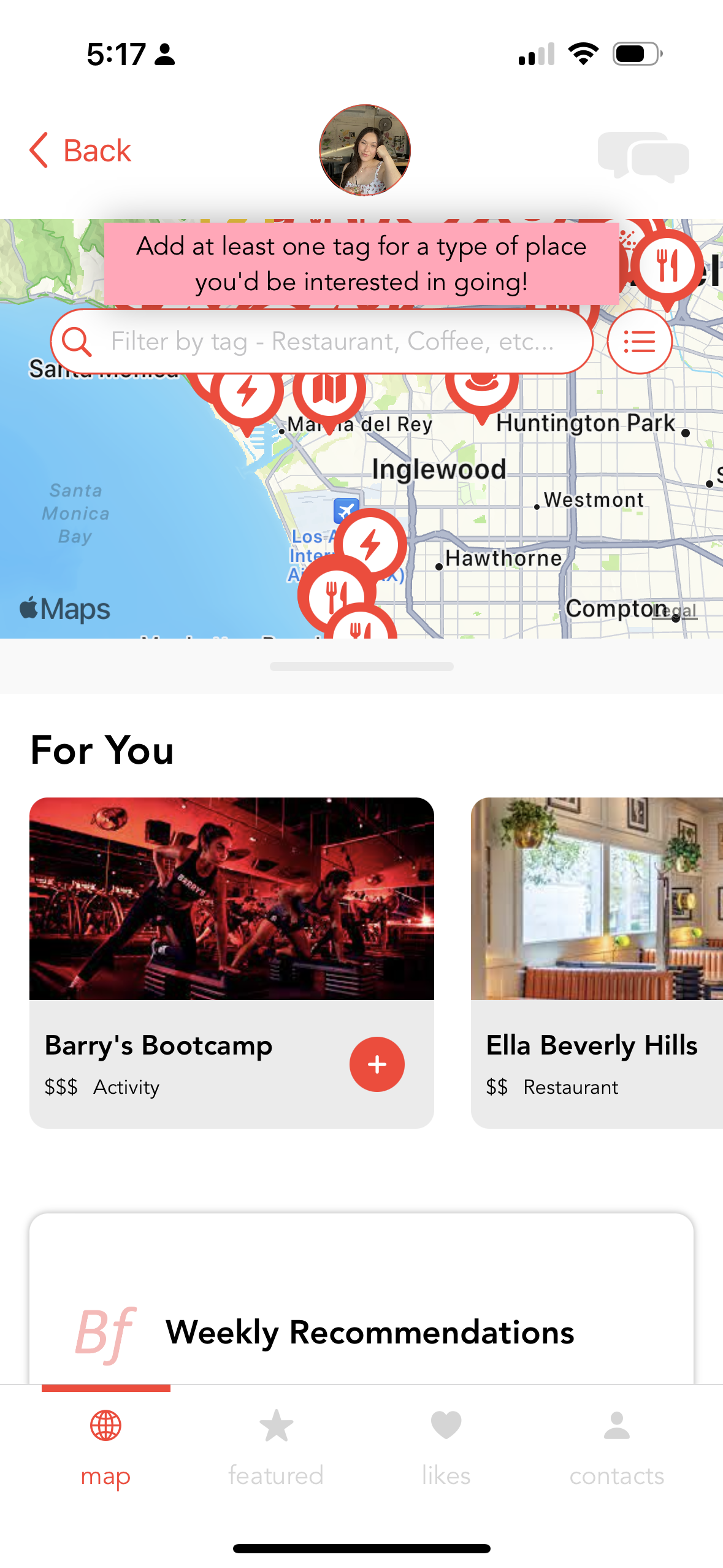
The team had already created an initial prototype of the app. I audited the design, keeping in mind user experience and interface design best practices.
-
I had to tap through several screens in order to find people to connect with.
-
Components and interactions did not follow intuition and lacked uniformity. This made exploring the app frustrating and mentally taxing.
-
The base UI kit they used gave no indication of who they are as a brand.
Initial Branding
While going through the prototype from a UX/UI perspective, I also documented the aspects of the brand, including colors, font weights, and more.
Users
Buffet is an LA-based company that wanted to start in their hometown as a proof of concept before expanding across the US, and later, the world!
Therefore, our target audience was 20 - 35-year-old Angelenos who were interested in meeting new people, romantically and/or platonically.
Lives in Los Angeles
Lives in Los Angeles

20 - 35 Years Old
20 - 35 Years Old

Tech savvy
Tech savvy

Looking to meet new people
Looking to meet new people
User Research
To better orient myself and inform my designs, I performed user interviews.
I asked questions regarding the interviewees’ feelings and current processes around making friends, dating, and the apps they use to do those things.
“We eventually turn into pen pals — it’s frustrating that nothing ever leaves the app.”
On matching with people then never meeting in person

From talking to users, Buffet’s concept had a ready audience, looking for something better than their current dating-focused apps.
“I feel like I need to meet people in person to actually tell if I’m interested.”
About determining compatibility when matching on dating apps

“People don’t seem to prioritize it as much as they do dating apps.”
About using Bumble BFF

Market Research
I looked to various market competitors to get a sense of industry standards regarding quality and various features. While Buffet is not a dating app, it was important that users felt it was familiar based on their current mental schemas.

Tinder
-
Tinder is the originator of the “swipe” motion for matching. However, this felt a bit cheap and our users want authenticity.

Bumble
-
Bumble BFF is the only large mainstream app for friendship that our target audience would know about.

Hinge
-
Hinge provided a number of different profile feature, allowing users to better showcase their personalities.

Grazer
-
Grazer was one of the few apps that had both friendship and dating on the same platform.
I used the commonalities between the apps as guidelines for features and information to include in Buffet.
When it came to the differences, I focused on feeling, thinking about what would best capture the authenticity and sincerity of inviting someone to meet up.

DESIGN

Based on the findings during the discovery phase, I recommended changes to their current product’s information architecture.
User Flow and Information Architecture
My proposed IA made their unique selling proposition center-stage and easy to access.
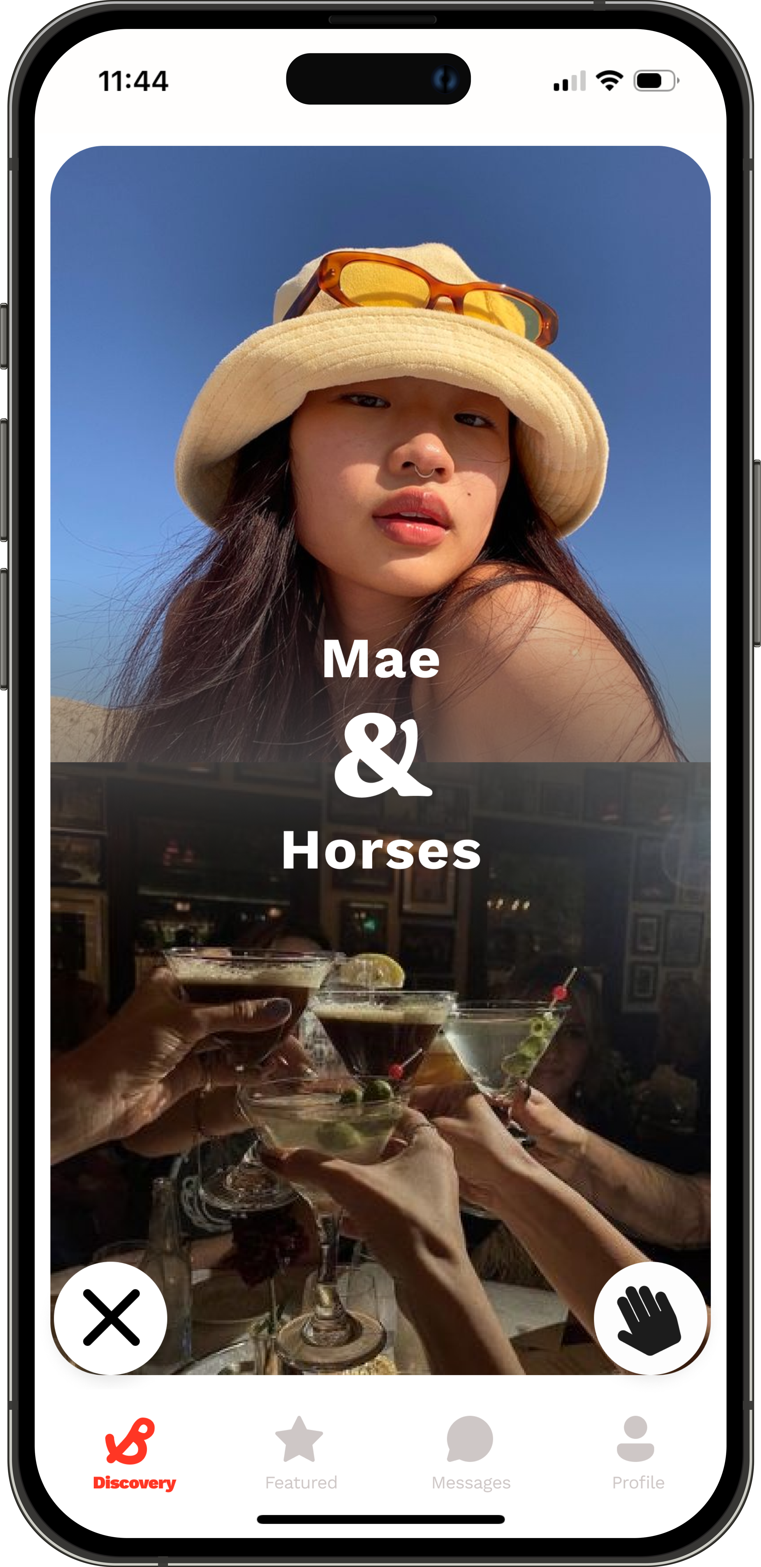
The user flows that followed focused on keeping the main selling points of the product to a few taps. Our users are used to quick and intuitive apps, so Buffet had to be the same!
Sketches
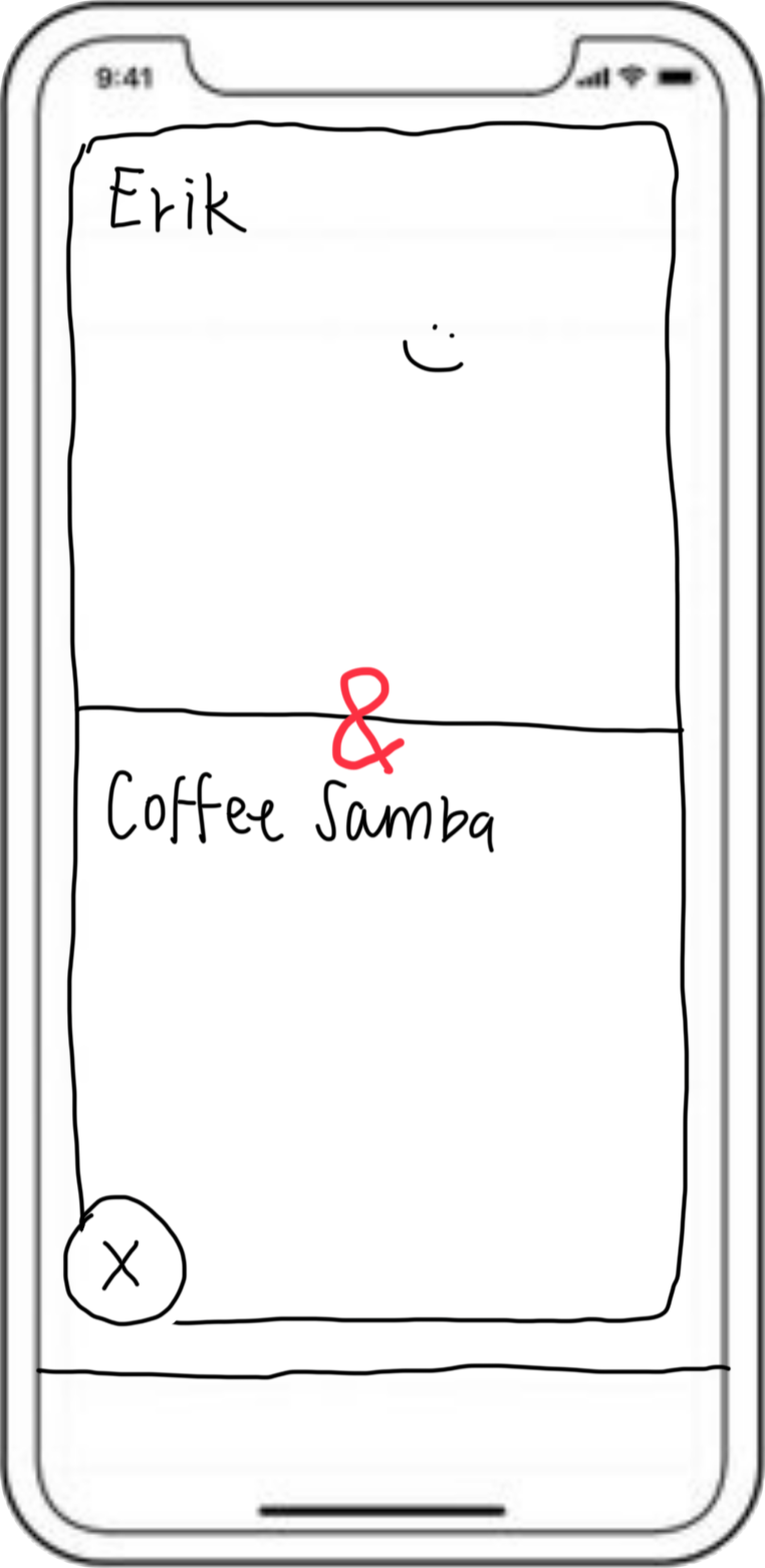
Once the changes to the app structure were approved, I got to work drawing out screens. Depending on the feature, I tried different layouts, keeping in mind the expectations our core audience would have for a product of this nature.


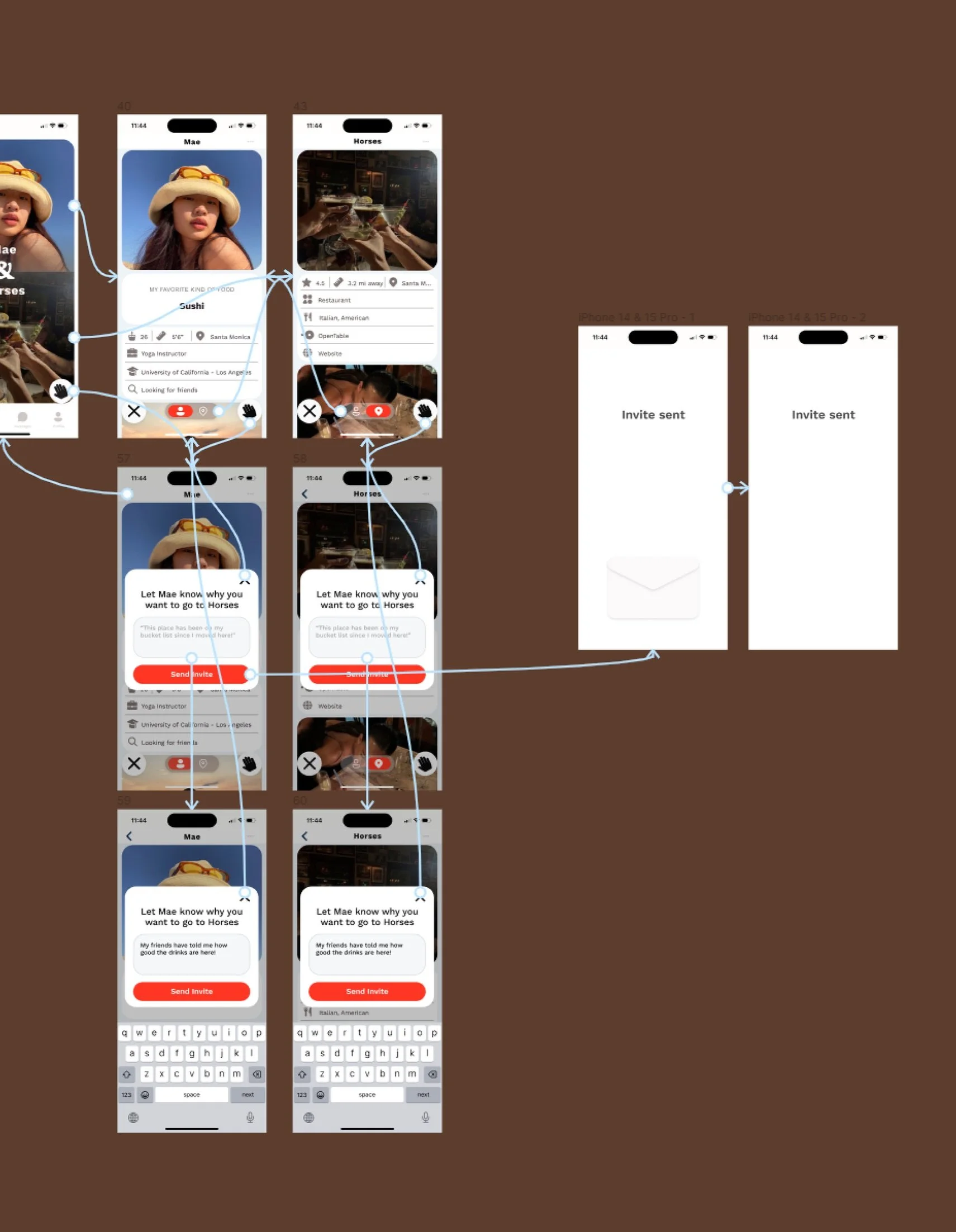
Wireframing and Prototyping
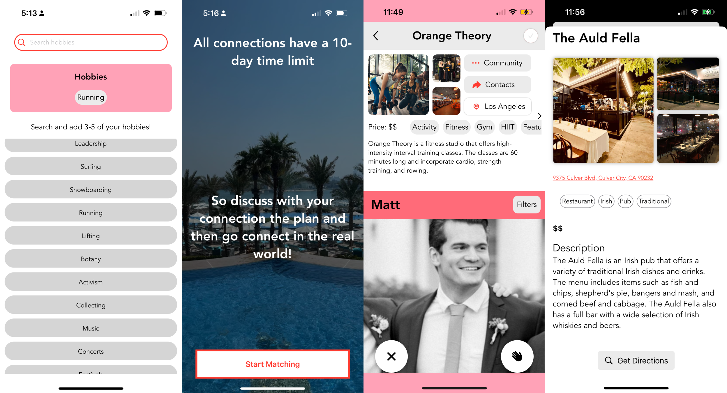
With our tight schedule, I made high-fidelity wireframes to showcase how the product would look. This helped the cofounders approve the designs and trust the vision I had for their product.
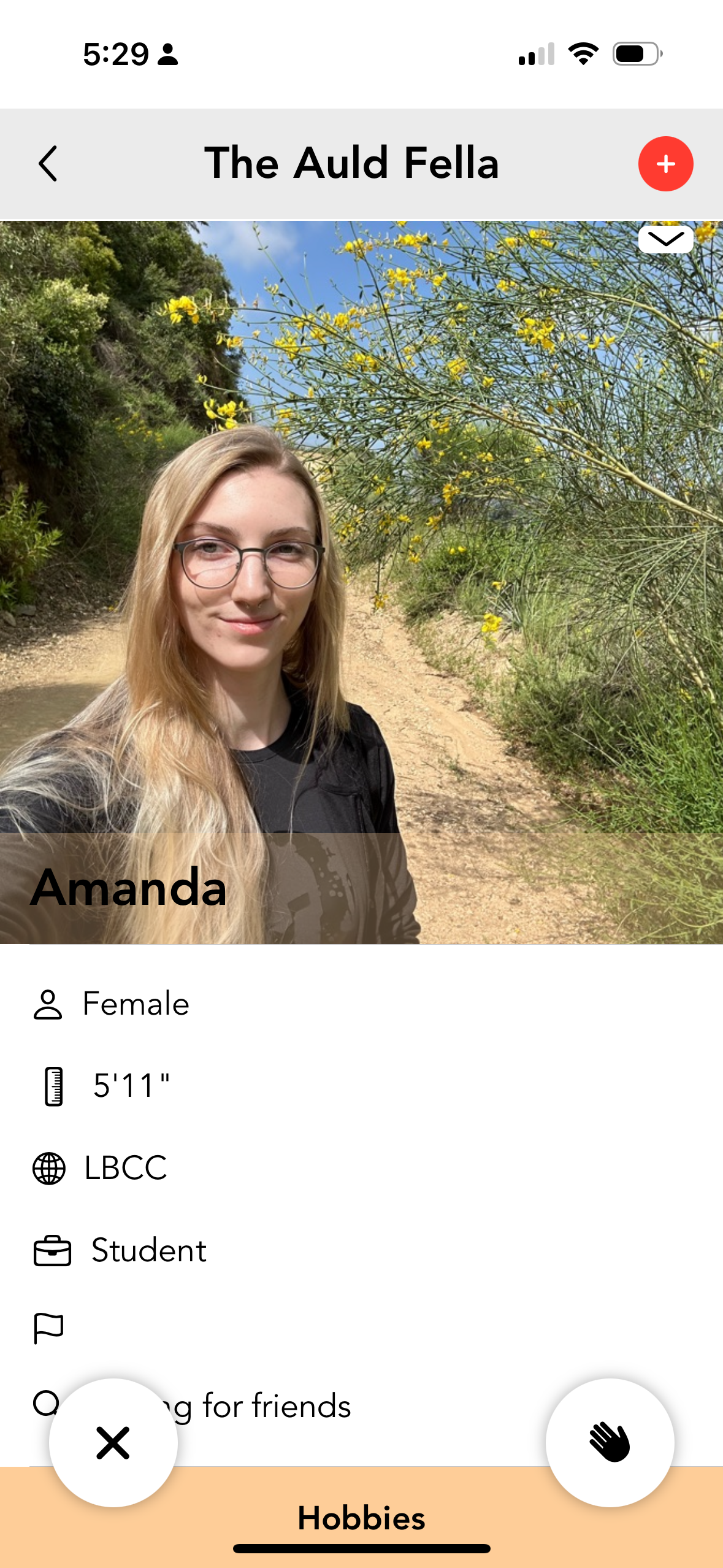
Since we had a new and different selling point, I made the prototypes that followed the full process of connecting and making plans with a new connection.


TEST
I ran usability testing using my above prototypes.
Through these tests, I ensured the flow was intuitive and simple, while also evaluating the concept’s reception.
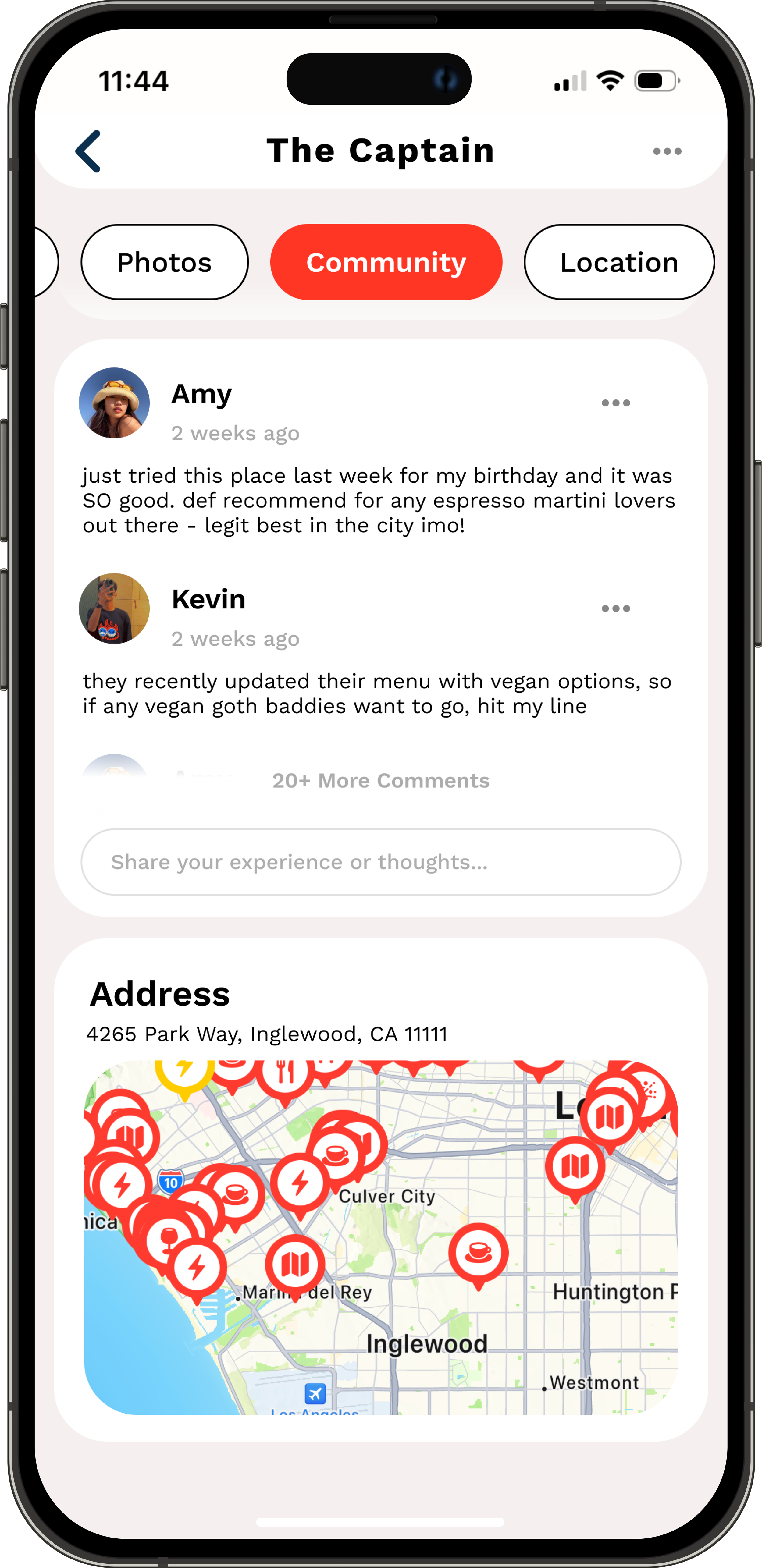
From testing, we realized a last-minute feature they wanted to add — the community feature — should wait until we had more time for R & D.
Usability Testing
FINAL PRODUCT
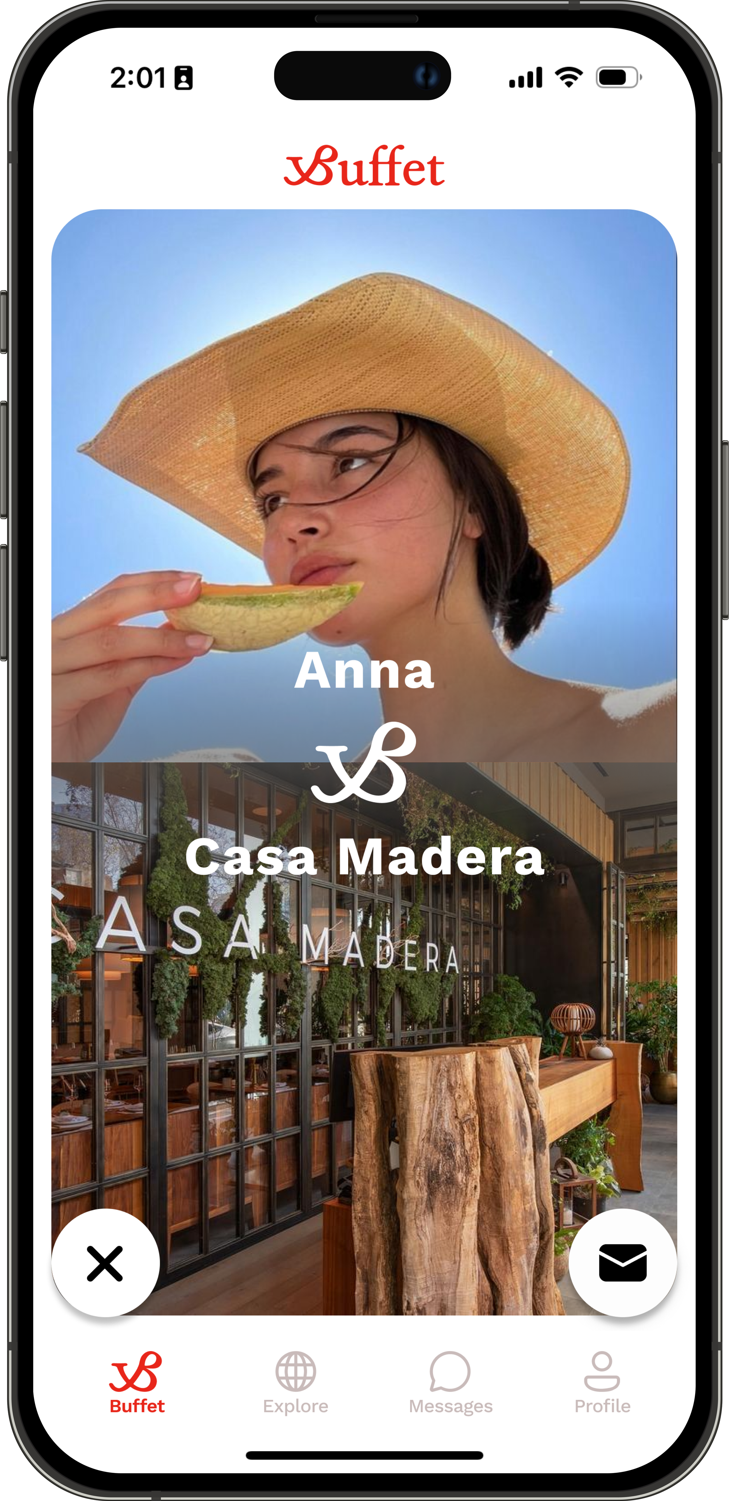
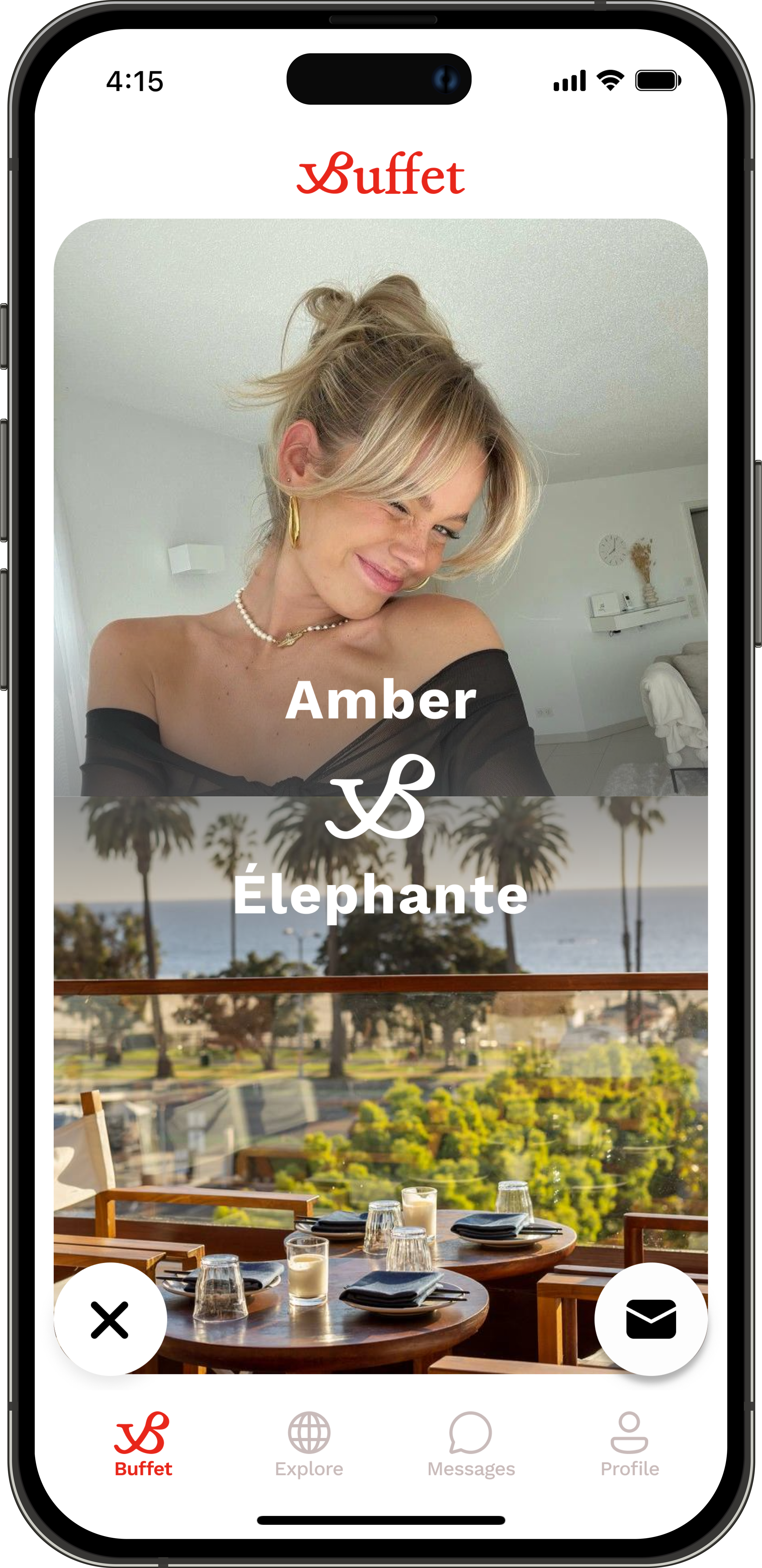
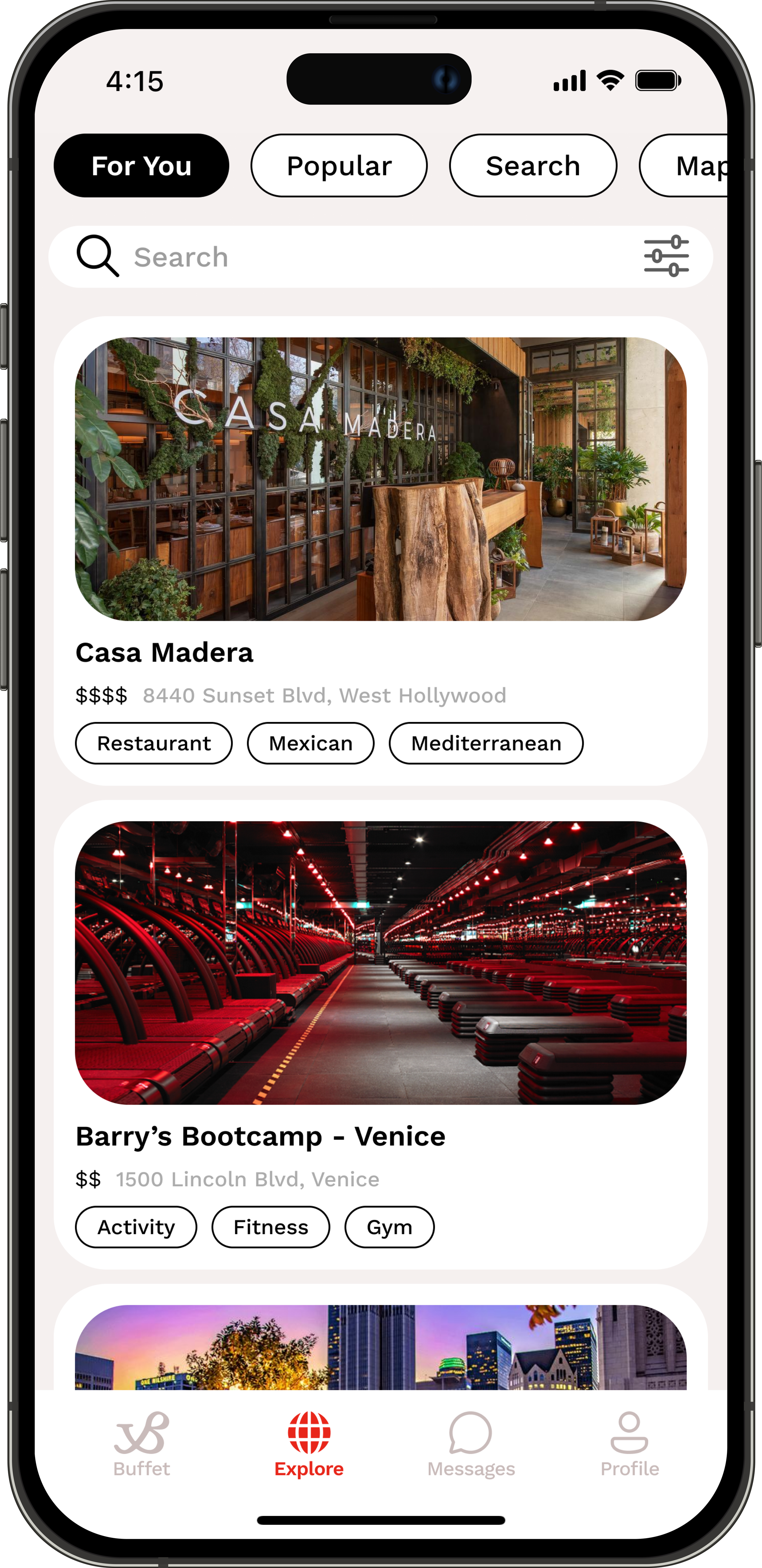
After I made important design changes, I worked closely with the developer during handoff. We discussed motion design, padding, empty states, and more over numerous calls to make sure the experience felt easy and seamless.


BRANDING
While Buffet’s founders had a vision of where they wanted to take the product, they hadn’t fully developed their brand. I was asked to turn vague ideas into a full-blown brand. No sweat.


Conceptualization
I started with user research for our target audience then looked into the current zeitgeist for millenials and Gen Z through news articles, Instagram, and TikTok. From there, I started thinking about Buffet’s mission and the feeling it wanted to capture among its members.
Buffet and its target audience were craving authenticity and deeper, more meaningful social connections. Buffet aimed to facilitate this by providing an easier way to meet in person.
That inspiration turned into these visuals I pulled from online, capturing the experience Buffet members crave when they use our app.


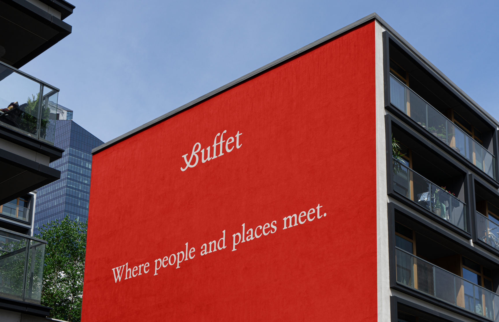
Where people & place meet.
Where people & place meet.

Old LogoThe Logo
With the instructions of incorporating the “B” in Buffet, I tried a myriad of different designs for the logo. The final logo came after an idea of focusing on how Buffet is people AND places.

New LogoThe Colors
The co-founders only asked that their brand color be a warm, bold red.
I developed the rest of the palette with its use in a mobile app in mind. Opting for a monochrome palette would allow the content, our members and their profiles, to shine!
DFD0CF
F5F0EF
E8261A
FAFAFA
26211C
Typography
ZT Bros Oskon 90s is a cool, retro serif font. It feels more personal than the sans serif fonts that other, similar apps use in their marketing materials, adding to the authenticity of Buffet’s brand.
Being a mobile product, Work Sans was chosen as the main font for use, in-app.

